Entertainment center wall unit: designing TV, storage and display as one system
An entertainment center wall unit is three elements of cabinetry designed as one: a storage base, a frame for the television and a display area for books and objects. When those three parts are planned together, the wall reads as a single, coherent surface. When they’re chosen separately, the result is a TV console, a few shelves and a screen that never quite line up. The difference lies almost entirely in how the wall is divided before anything is built.
The three zones of an entertainment center wall unit
The most reliable way to design a full media wall is to split it horizontally into three zones, each with a different job, and then decide how the zones connect.
The base: closed storage below 30 inches
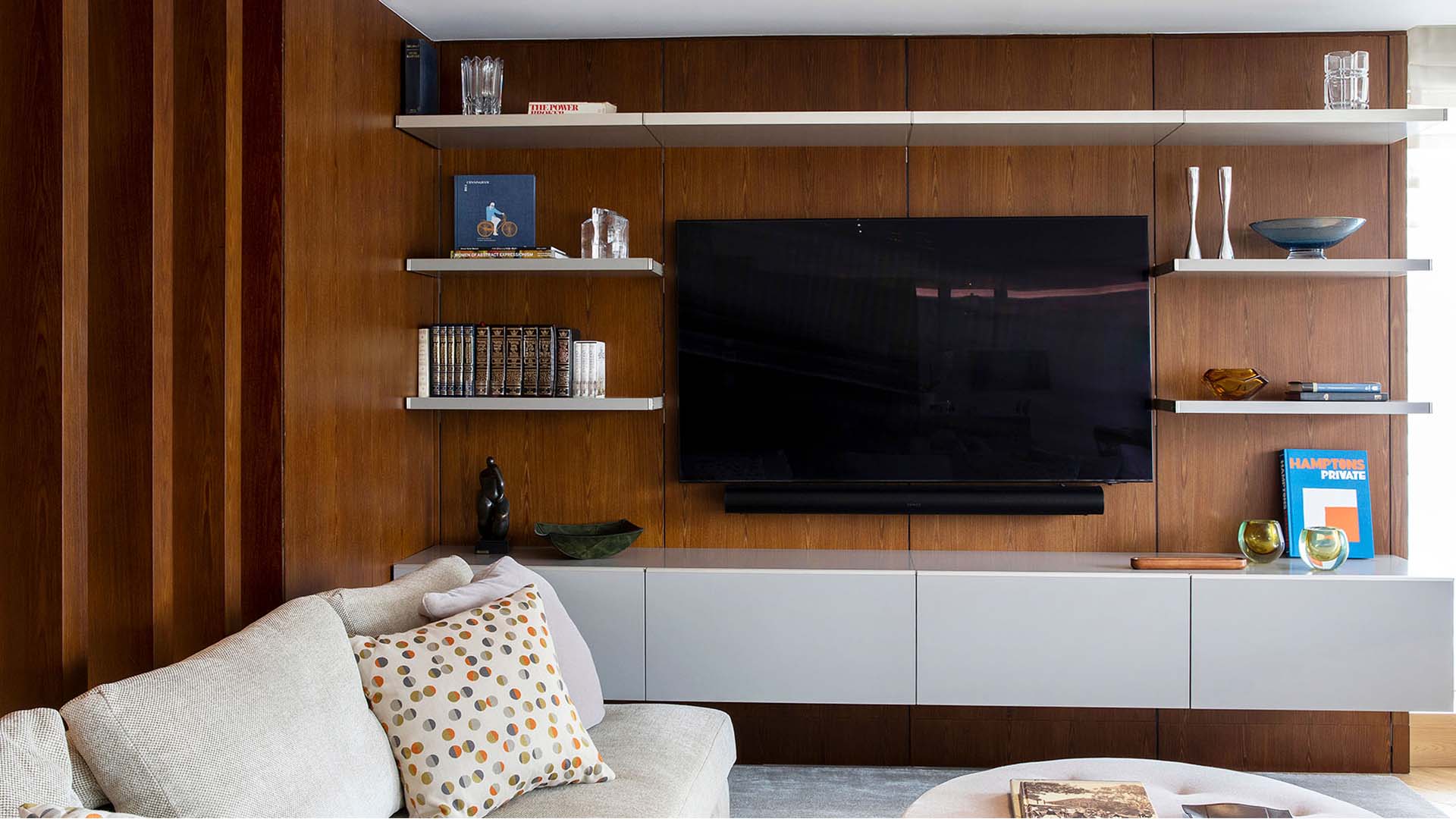
The lower band, usually between 18 and 30 inches high, holds the heavy, unattractive and frequently used things: media equipment, games, cables, blankets, archive boxes. It should be mostly closed, with doors or drawers, and it’s typically the deepest part of the wall, around 18 to 20 inches. Its top also works as a continuous ledge for a soundbar, a lamp or a few objects.
The screen zone: framing the TV
The middle band is defined by the television. The screen should be centered close to 42 inches from the floor for comfortable viewing from a standard sofa, and the space around it should be designed rather than left over. A recessed back panel in a darker finish, a slight setback of the TV from the shelving on either side, or a continuous frame around the screen all make the TV look integrated, even when it’s off.
The display zone: shelves and niches above and beside
The upper band, from roughly 60 inches up to the ceiling, is where the wall becomes personal: books, art, ceramics, photographs. Shelving here can be shallower, 10 to 14 inches, which makes the upper part of the wall feel lighter than the base. In rooms with ceilings of 9 feet or more, running this zone all the way up is what gives the composition its architectural presence.
Symmetry or asymmetry: composing a wall entertainment center
Once the zones are set, the next decision is where the TV sits along the wall. A centered screen with matching towers of storage on either side is the classic layout of a wall entertainment center. It’s calm, formal and easy to balance, and it works best when the wall is symmetrical itself, with the sofa centered in front of it.
Real walls are often less cooperative. A window on one side, a door near a corner, a fireplace that isn’t centered: in these cases an asymmetrical composition usually works better. The TV moves toward one end, aligned with the seating, and the storage extends as a long horizontal band toward the other end, with open shelving above it. The balance comes from proportions rather than mirror images, with a large closed block on one side answered by a wider spread of lighter shelves on the other.
Asymmetry is also useful on very long walls. On a wall of 16 feet or more, a centered TV between two identical towers can look static and leave each side too heavy; moving the screen off-center and letting the base run continuously underneath gives the composition direction and a more relaxed, contemporary feel.
Wall units and shelving: the ratio between open and closed storage
The most common mistake in large wall units and shelving compositions is too much open space. A wall that is 60 percent open shelving needs a lot of carefully chosen objects to look good, and in daily life it fills up with whatever is at hand. A more forgiving ratio is roughly two-thirds closed storage and one-third open shelving, with the open parts concentrated at eye level and above, where display has the most impact.
How the open shelves are filled matters as much as how many there are. Books work best in continuous runs, grouped by height or color, while objects read better in small clusters with empty space around them. Leaving some shelves deliberately half empty is what keeps a full wall from looking crowded.
Lighting a TV wall unit without glare on the screen
Light is what turns a TV wall unit from storage into a feature of the room, but it has to be placed with the screen in mind. LED strips mounted at the front edge of shelves, facing back and down, light the objects without shining into the room or reflecting on the TV. Vertical LED profiles inside the side towers give a soft, even glow. A warm color temperature, around 2700 to 3000 K, keeps the effect residential rather than commercial.
Behind the screen, a low-intensity bias light reduces eye strain when watching in the dark and makes the TV feel set into the wall. Every lighting circuit should be dimmable and, ideally, controlled separately from the room’s main lights, so the wall can go from display to cinema mode with one switch.
How Ornare builds living room wall units zone by zone
Ornare designs living room wall units to the exact dimensions of the wall, so the three zones, the screen and the lighting are resolved in the same project, and the collections can be thought of in terms of the zone they serve best.
For the base, Ornare’s Timeless line offers modules with doors, drawers, niches and worktops in solid wood and natural leather, the right materials for the part of the wall that is touched every day. For the display zone, Ikigai uses slim vertical metal profiles and shelves with integrated LED lighting, which can be closed with wooden sliding panels when the wall should look quieter. When the whole surface, screen included, should be treated as one continuous composition, Square Wall combines vertical and horizontal panels, steel square shelves and integrated cabinetry elements arranged across the wall.
One practical detail makes a visible difference: stepping the depth. A wall unit with an 18- to 20-inch base and 12- to 14-inch shelves above casts a natural shadow line where the two meet, makes the upper part look lighter, and leaves more room in front of the wall where people actually stand.