Bookshelves for large walls: how to scale storage to the room
A large wall without a designed system looks like an oversight. The furniture in front of it — the sofa, the chairs, the coffee table — does its job, but the wall behind it is just surface. This is the specific problem that bookshelves for large walls solve, and it’s a problem that’s more common than it might seem: living rooms in Dallas, Houston, and Los Angeles frequently have walls that run 14, 16, or even 20 feet wide, and the standard approach of placing a couple of freestanding units against them leaves more wall unresolved than covered.
The challenge isn’t finding shelving that’s big enough. It’s designing a system at the right scale — one that anchors the wall without making the room feel closed in, that distributes storage and display functions in proportions that work for the actual space, and that handles the visual complexity of a large surface without producing a result that reads as busy or overwhelming. Getting this right requires thinking about the wall as an architectural element rather than as a backdrop for furniture.
The under-scaling problem: why single units fail on large walls
The most common approach to a large living room wall — placing one or two freestanding bookcases against it — almost always fails on the same dimension. A 36-inch bookcase on a 16-foot wall covers 19% of the wall width. Even two units placed symmetrically cover less than 40% of the surface. The remaining wall — the majority of it — is either empty or filled with art, mirrors, and objects that don’t add up to a coherent composition.
The visual problem isn’t the bookcase itself. It’s the relationship between the bookcase and the wall that contains it. A bookcase that ends before the wall ends draws attention to the gap — to the space that wasn’t addressed. In a room where the wall is meant to be a focal point, that gap undermines the entire composition. No amount of styling on the shelves or art on the adjacent wall sections resolves the fundamental proportion problem: the storage element is too small for the surface it’s on.
A wall-to-wall bookshelf system eliminates this problem by treating the full wall width as the unit of design. When the system runs from one side of the room to the other, the proportion relationship between the bookshelf and the wall disappears — they become the same thing. The eye reads the wall as a continuous designed surface rather than registering a bookcase and the spaces around it.
Vertical scale: how ceiling height determines system height and visual density
On a large wall, the vertical dimension is as important as the horizontal. A living room with 10-foot or 11-foot ceilings — common in newer construction homes in Dallas, Houston, and the Hamptons — has a vertical scale that a standard-height bookshelf doesn’t address. A system that stops at 84 inches on a 132-inch ceiling leaves 48 inches of wall above the bookshelf — more than a third of the wall height — as dead space. The visual proportion of the room suffers in the same way it does when a bookshelf is too narrow for its wall.
A floor-to-ceiling bookshelf system on a large wall changes the room’s proportions in two directions simultaneously. Horizontally, it resolves the full wall width. Vertically, it fills the full ceiling height, which draws the eye upward and makes the ceiling feel higher rather than lower. This upward movement of attention is one of the reasons large wall bookshelves in rooms with significant ceiling height feel expansive rather than oppressive — the vertical scale of the system amplifies the room’s height rather than competing with it.
The practical implication is that the upper sections of a floor-to-ceiling system on a large wall need to be designed for their position in the composition, not just for storage efficiency. Sections above 84 inches are difficult to access without a step stool, which makes them appropriate for items used infrequently: seasonal objects, rarely consulted reference books, archival storage. Designing these upper sections as display areas — with objects selected for their visual quality rather than their accessibility — turns a potential liability into a compositional asset.
Horizontal composition: how to distribute functions across a large bookshelf wall
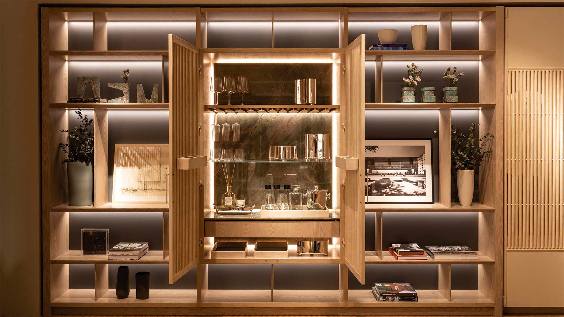
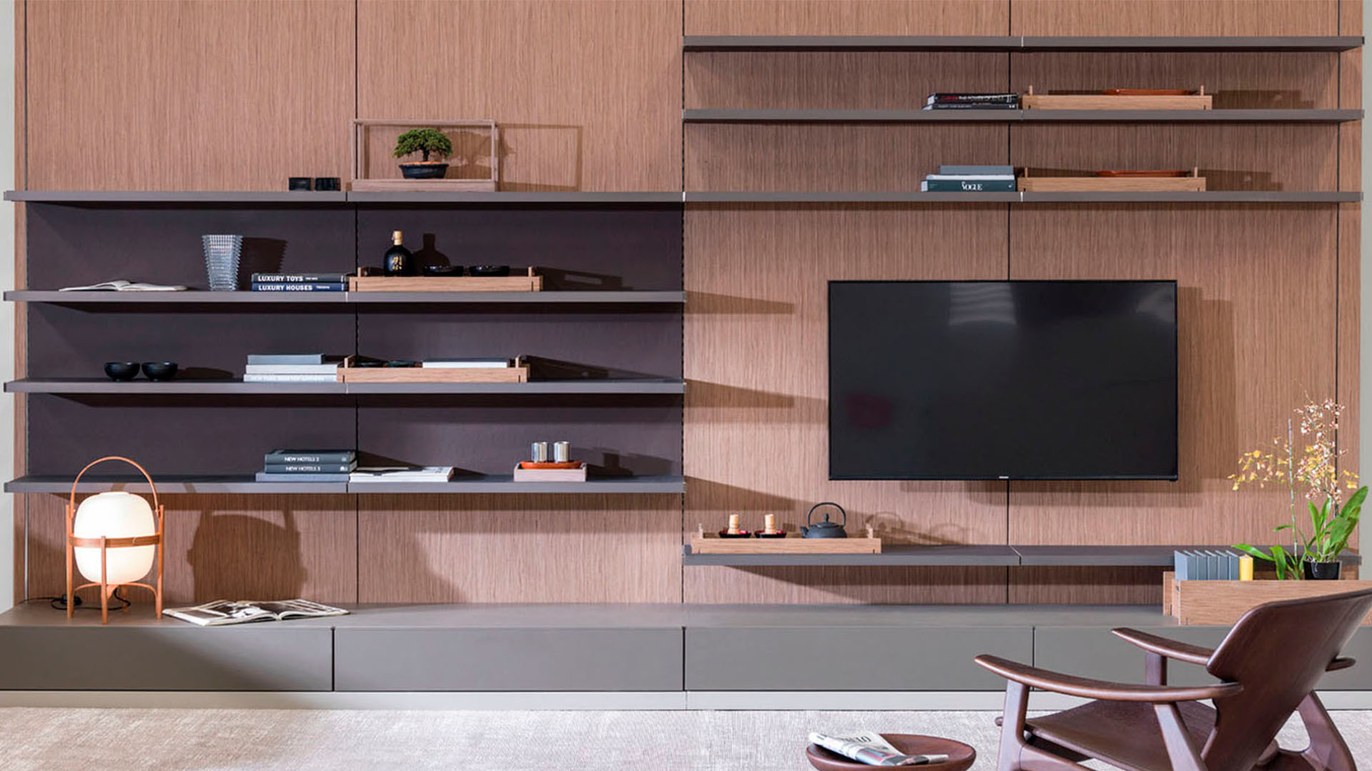
A 16-foot bookshelf wall has enough horizontal space to handle multiple distinct functions within a single continuous composition. Open shelving for books and display objects. Closed lower cabinets for storage that doesn’t benefit from visibility. A central section for a television or a feature display. A bar section for bottles and glassware. All of these functions can coexist within a single wall system — with the proportions between them designed for the room and the household rather than defaulted to equal distribution.
The question of how to distribute these functions is the central design problem in a large wall bookshelf project. Symmetrical compositions — equal sections flanking a central element — read as formal and settled. They work well in rooms with a traditional or transitional design language, or in rooms where the wall faces a defined seating arrangement that the symmetry mirrors. Asymmetrical compositions — a wider section on one side, a narrower section on the other, the focal element off-center — read as more contemporary and more dynamic. They work better in rooms with a less formal character, or where the adjacent architecture (windows, doors, fireplace) doesn’t allow perfect symmetry.
Ornare’s Wall System Living handles both approaches with equal flexibility. The module widths are determined by the design, not by standard sizes, which means the central feature section can be exactly the width that the television or artwork requires, and the flanking sections can be proportioned to balance it correctly rather than to equal its width. For anyone working through a large wall composition in New York, Miami, or Palm Beach, the Ornare showroom in each city has installations that demonstrate different compositional approaches within large wall systems — useful reference points for deciding on proportional distribution before the system is specified.
Material choice at large scale: how finish reads differently across 16 feet
The material of a large wall bookshelf reads differently than the same material on a smaller system, because the surface area involved changes how the eye processes the finish. A wood veneer finish on a 36-inch bookcase is furniture. The same finish across a 16-foot wall is architecture — the grain becomes a pattern at room scale, the color becomes the dominant tone of the wall, and the material’s response to light becomes a dynamic quality of the room rather than a characteristic of a piece of furniture.
This scale effect is most pronounced with natural wood veneer, where the grain selection across adjacent panels determines whether the large surface reads as a continuous composition or as a collection of panels placed next to each other. Ornare selects veneer for grain consistency across the full span of a wall system — which requires treating the 16-foot wall as a single surface during the selection process rather than as a series of individual modules that happen to be adjacent. The result is a large wall where the grain runs with visual continuity across the full width, producing the architectural quality that makes the difference between a bookshelf that fills a wall and one that defines it.