Kitchen cabinet design: how layout determines which collection works
Most people choose a kitchen collection before they’ve fully resolved the layout — and then spend the rest of the project trying to make the two work together. The more reliable sequence is the reverse: settle the layout first, understand what the space requires visually and functionally, and then select the kitchen cabinet design that responds to those requirements. A collection that’s chosen for aesthetic reasons alone, without reference to the specific layout it’s going in, frequently produces a result that looks good in a showroom but feels off in the actual kitchen.
The layout isn’t just about where things go. It determines the proportions of the cabinet wall, the amount of vertical space available, the relationship between the kitchen and adjacent rooms, and the visual weight the kitchen needs to carry in the overall interior. Each of these variables has implications for which collection works — and which doesn’t.
Single-wall and galley layouts: what cabinet design works when the kitchen is linear
A single-wall kitchen — all cabinets and appliances on one wall — concentrates everything into a continuous horizontal composition. In this layout, the kitchen cabinet design needs to handle a wide horizontal surface without looking like a row of identical units pushed together. Collections with strong vertical elements — tall column units, upper cabinets that reach the ceiling, doors with pronounced vertical lines — break the horizontal monotony and give the wall a more composed appearance.
Sky is particularly well suited to single-wall layouts because of its emphasis on verticality: tall upper units that draw the eye upward change the visual proportion of a linear kitchen significantly, making it feel less like a corridor and more like a designed wall. Minimal works well in this context too — the handleless doors and continuous surfaces read as a single architectural element rather than a sequence of individual cabinets, which suits a kitchen that needs to recede into an open-plan space. The galley layout has similar characteristics, with two parallel runs of cabinets facing each other. Here, collection consistency between the two walls is critical — a mismatch between the cabinet design on opposite walls creates visual tension that makes the kitchen feel narrower than it is.
L-shaped and U-shaped layouts: managing the corner and the visual weight
L-shaped and U-shaped kitchens introduce a corner — one of the most technically and visually challenging elements in kitchen cabinet design. The corner itself is handled mechanically through pull-out systems, carousel units, or diagonal cabinets, but the visual treatment of the corner junction is what determines whether the layout reads as intentional or awkward.
Collections with continuous surface planes — Minimal, Infinite, or Wall System — handle corners more cleanly than collections with prominent hardware or decorative detailing, because the transition between two walls reads as a continuation of the same surface rather than a collision between two separate elements. U-shaped layouts add a third run of cabinets, which increases the visual density of the kitchen. In these layouts, the balance between upper and lower cabinets matters more than in simpler configurations — too many upper cabinets on three walls can make the kitchen feel enclosed, while reducing uppers on one wall (or replacing them with open shelving) creates breathing room without sacrificing storage.
Open-plan kitchens: when the cabinet design is visible from the living room
When the kitchen opens into a living or dining area — which describes most contemporary residential layouts in Dallas, Houston, Miami, and New York — the kitchen cabinet design is never just a kitchen decision. The cabinets are visible from the sofa, from the dining table, and from the entry, which means they need to work visually at a distance as well as up close.
Collections that read well from a distance are those with clear design logic at the macro scale — either a strong material statement, a consistent geometric pattern, or a notable absence of visual complexity. Timeless works particularly well in open-plan contexts because the proportions are scaled for large rooms: the cabinet heights, door reveals, and overall composition hold up visually when viewed across 25 or 30 feet of open floor plan. Round introduces curves that soften the geometry of the kitchen wall from a distance, making the transition between the kitchen and the more residential character of the living area feel less abrupt. Colette and Breeze, with their warmer material registers, bridge kitchen and living area in contexts where a sharp contemporary contrast between the two zones would feel mismatched.
The Ornare showrooms in New York and Los Angeles both have installations that demonstrate how different collections read from varying distances — which is the most practical way to evaluate a collection for an open-plan kitchen before committing to it.
Island and peninsula layouts: how the central element changes the collection requirements
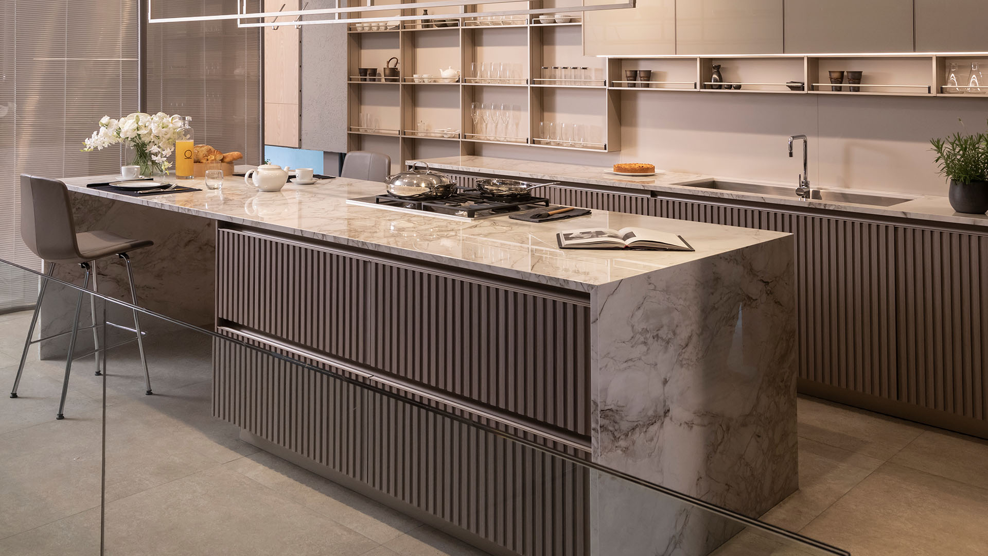
A kitchen with an island or peninsula has a central design element that’s visible from all sides — and that changes the requirements for the cabinet design significantly. The island is the piece of furniture in the kitchen that gets seen the most, touched the most, and photographed the most. It’s also the piece where the countertop material is most exposed, which means the relationship between the cabinet finish and the countertop is more consequential than in a wall-only kitchen.
Collections where the cabinet design has a strong horizontal emphasis — Slatted, Stripe, or Shaker — can read particularly well on an island because the horizontal lines at eye level give the island a grounded, substantial quality that lighter or more vertical designs don’t provide. Collections with a minimal surface treatment — no hardware, flush doors, continuous color — turn the island into a monolithic element that’s defined almost entirely by the countertop and its material. This works very well when the countertop is exceptional — a book-matched marble slab, a large-format stone — and less well when the countertop is a standard material that doesn’t carry that visual weight on its own.
The collection choice for the island doesn’t need to match the wall cabinets exactly — a two-tone kitchen, with different finishes on the island and the wall run, is a well-established design approach in contemporary kitchens. But the relationship between the two finishes needs to be deliberate. Ornare consultants at the Hamptons and Greenwich locations work through these combination decisions with clients using physical samples, because the interaction between two finishes at full scale is almost impossible to evaluate accurately from a digital rendering alone.